Overview
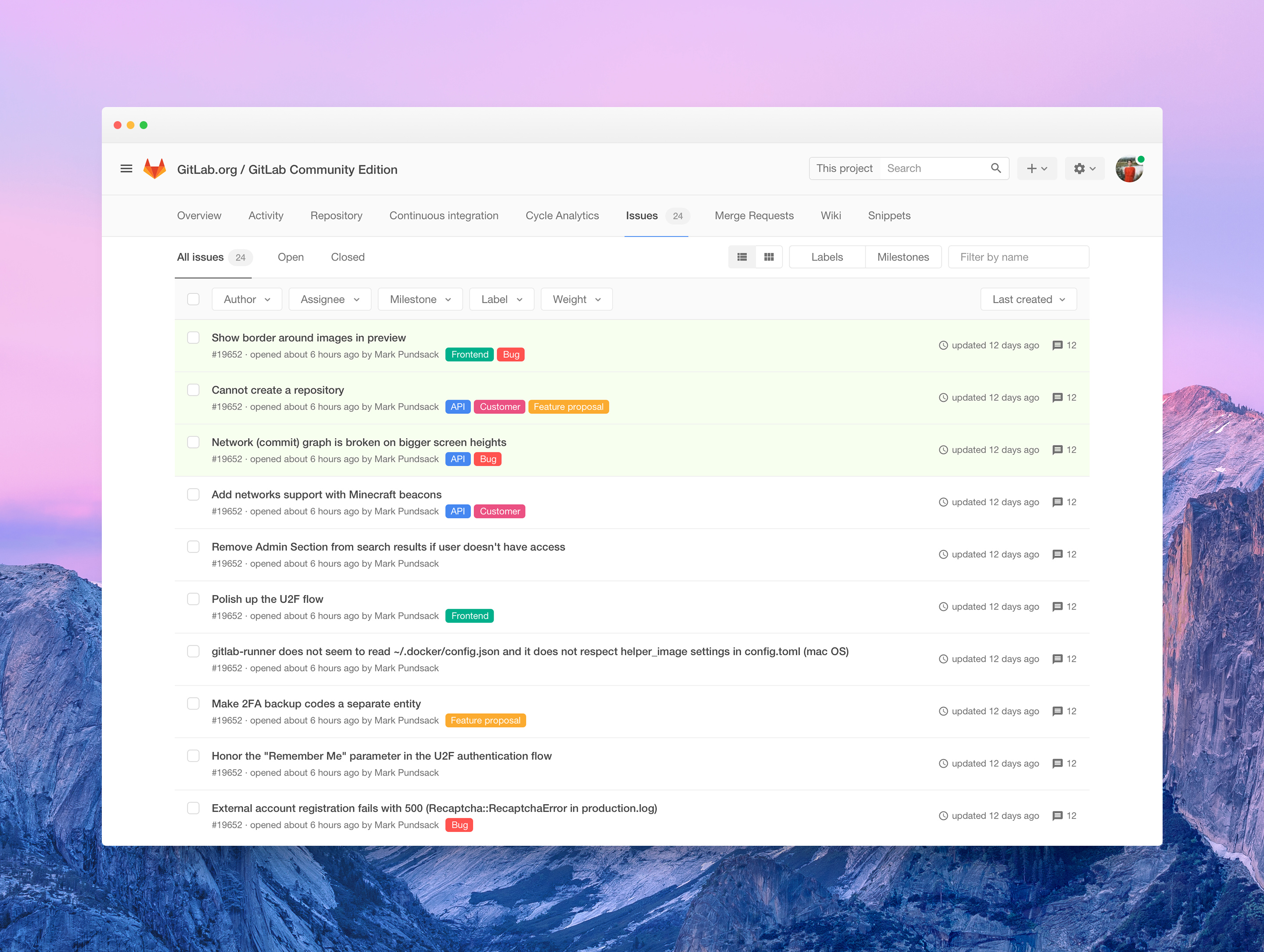
GitLab is an open-source code collaboration platform that enables developers to create and manage code bases collaboratively. It is a great way to manage git repositories on a centralized server. GitLab gives you complete control over your repositories or projects and allows you to decide whether they are public or private for free.
Defining problems
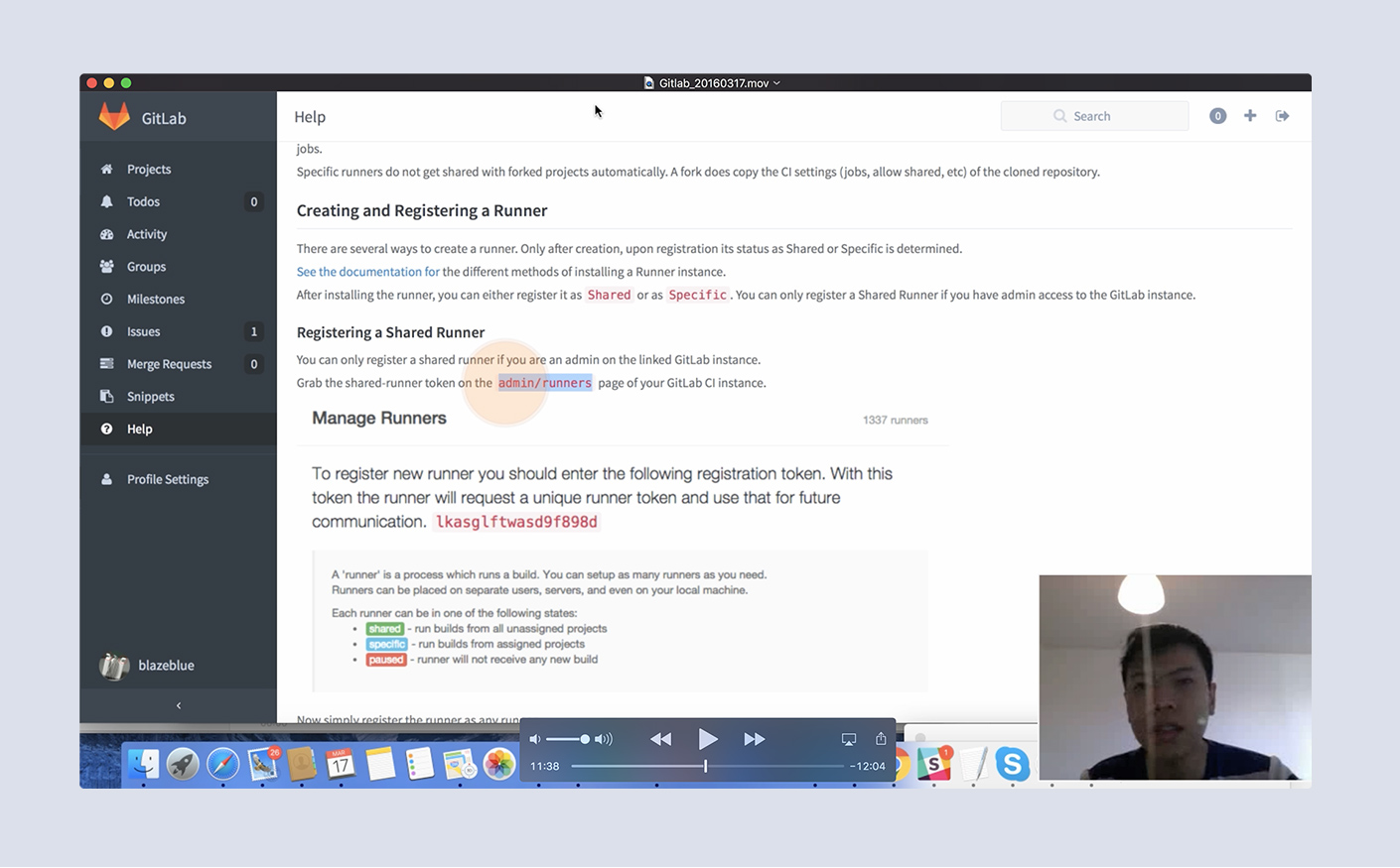
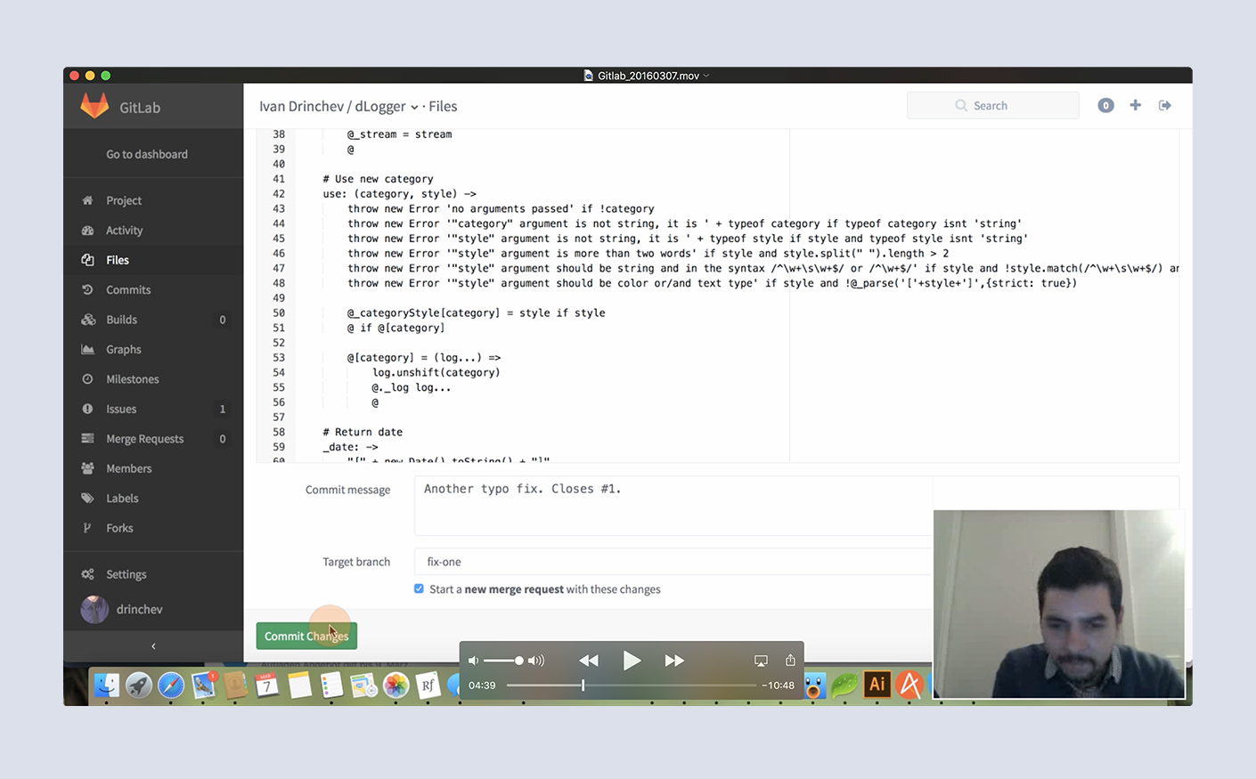
I conducted multiple user interviews and gathered a very good feedback. Interviewers went though the whole process by importing code from third party repository, creating an issue, automatically closing an issue and running tests with Gitlab CI.
Problems
Key concerns shaped the foundation of three main problems to tackle: GitLab CI setup, navigation and visual consistency across the platform.
How we can solve this?
Navigation. One of our biggest concerns was that it was easy to get lost in the navigation hierarchy with what we currently had. New users were very confused with constant changes of navigation items without any consistent pattern.
GitLab CI setup. The main problem with GitLab CI was that users did not understand how to write the test jobs and the documentation was not helpful. We decided to create a set of templates for popular programming languages to help users understand the main syntax to setup GitLab CI faster.
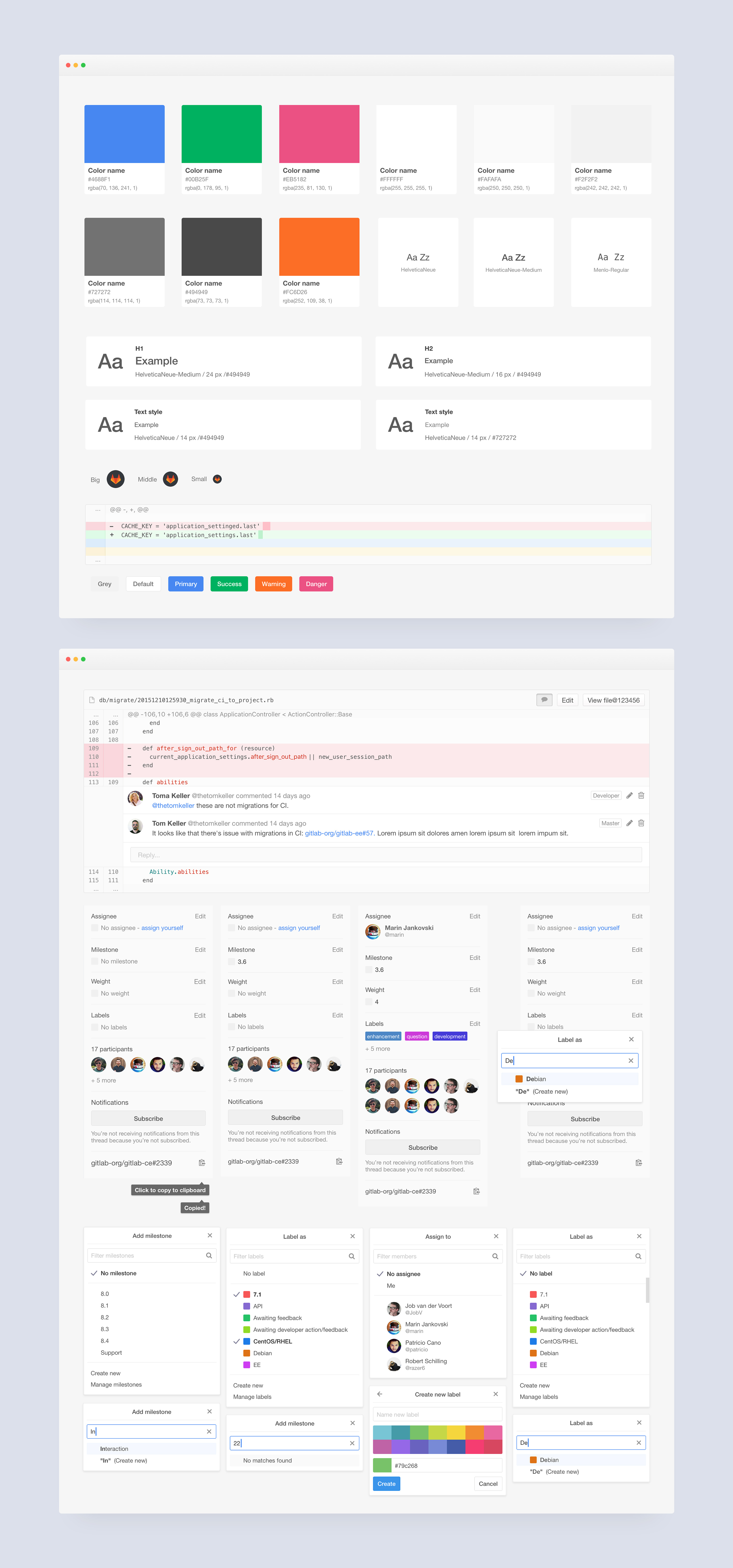
Visual consistency. I suggested to create a system with all visual components included. Since GitLab is open source it is helpful for contributors when they develop new features.
Navigation
We came to a realization that Gitlab community was building and launching features faster than our interface could handle. It was becoming harder for members to use our product, and it was becoming harder for them to scale it.
To build a holistic design solution, we started from ground zero to rethink our navigation, our hierarchy, and our overall structure.
From the beginning, we were clear about one requirement: our new navigation needed to be able to scale with us as we grow. This required us to think deeply about where the product was headed and how to make space accordingly. Any design that couldn’t expand as we did wouldn’t be considered.
Release candidate
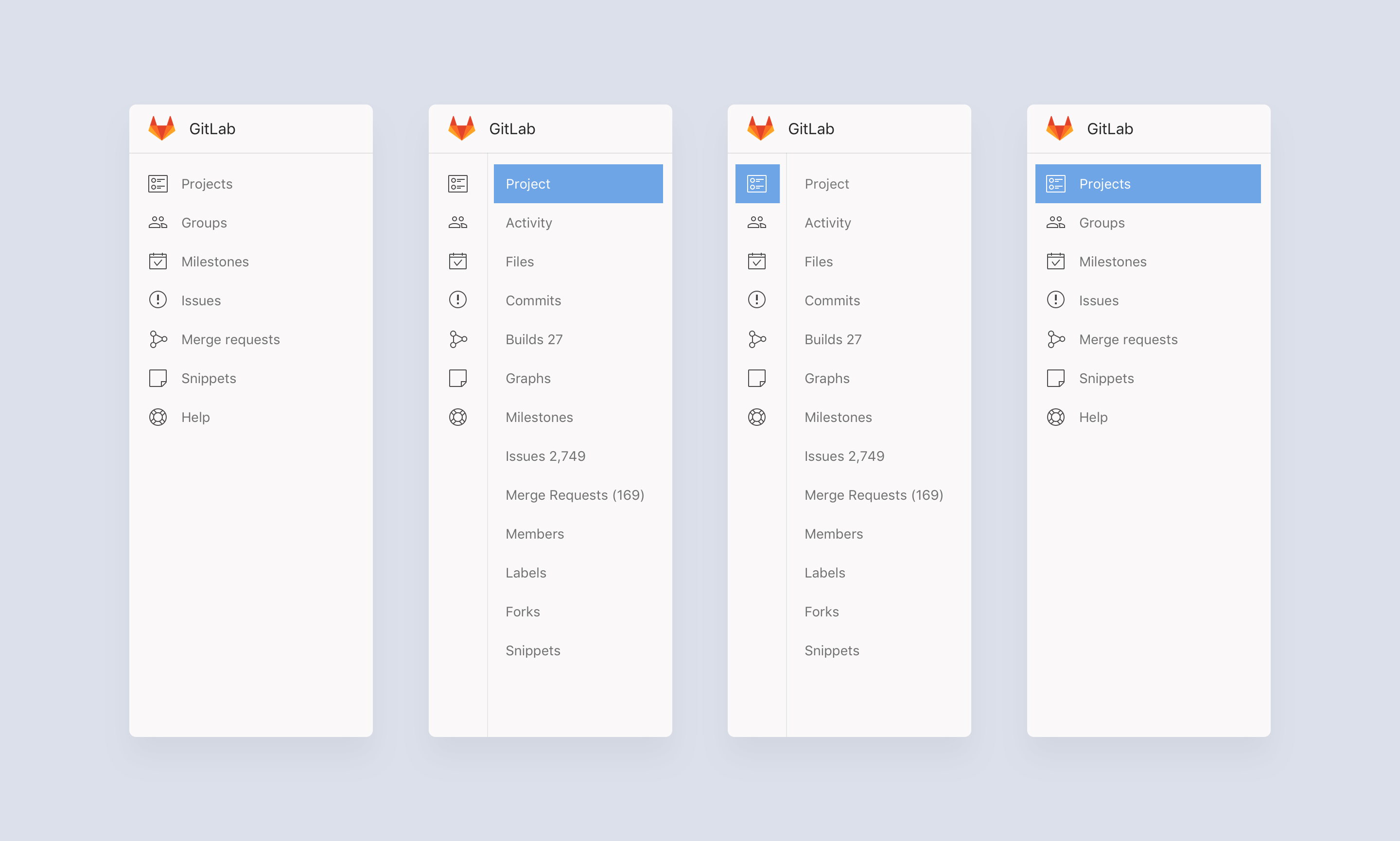
I designed a prototype where the projects menu was displayed within the dashboard navigation. So when users visit the dashboard page you see one level of links, and when you visit a project or group page the dashboard links get collapsed to icons and the next level of navigation is displayed.
Validation
User testing and feedback during that release candidate was far from what we expected. Instead of making things easier to understand and use, we confused users even more. The community feedback was an invaluable source of information, so we made the decision to rollback the change.
A different approach
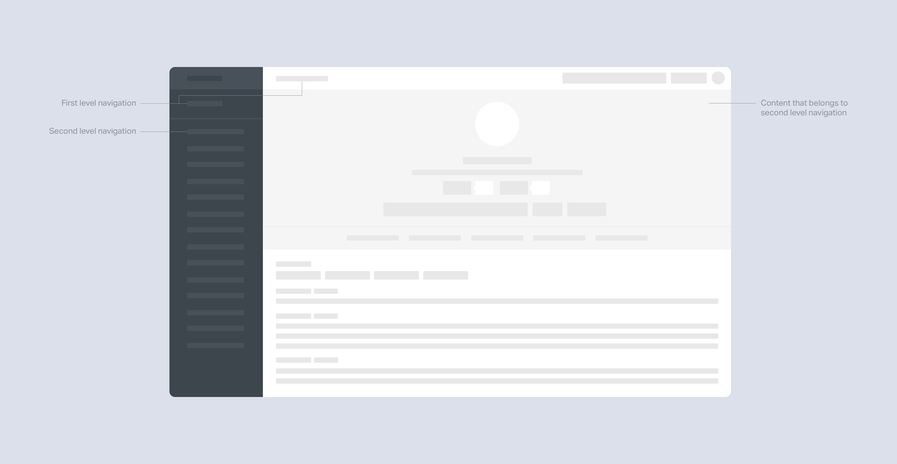
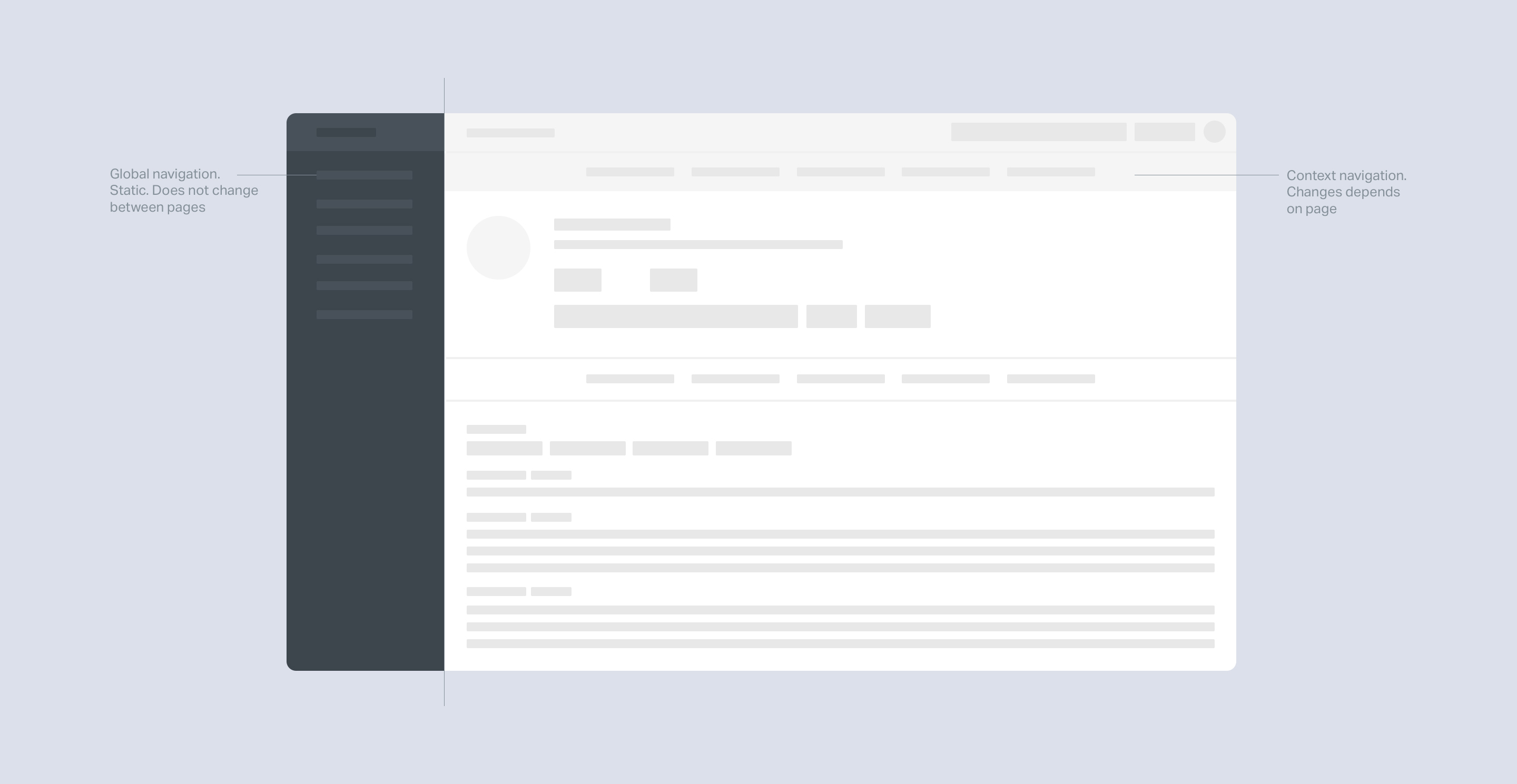
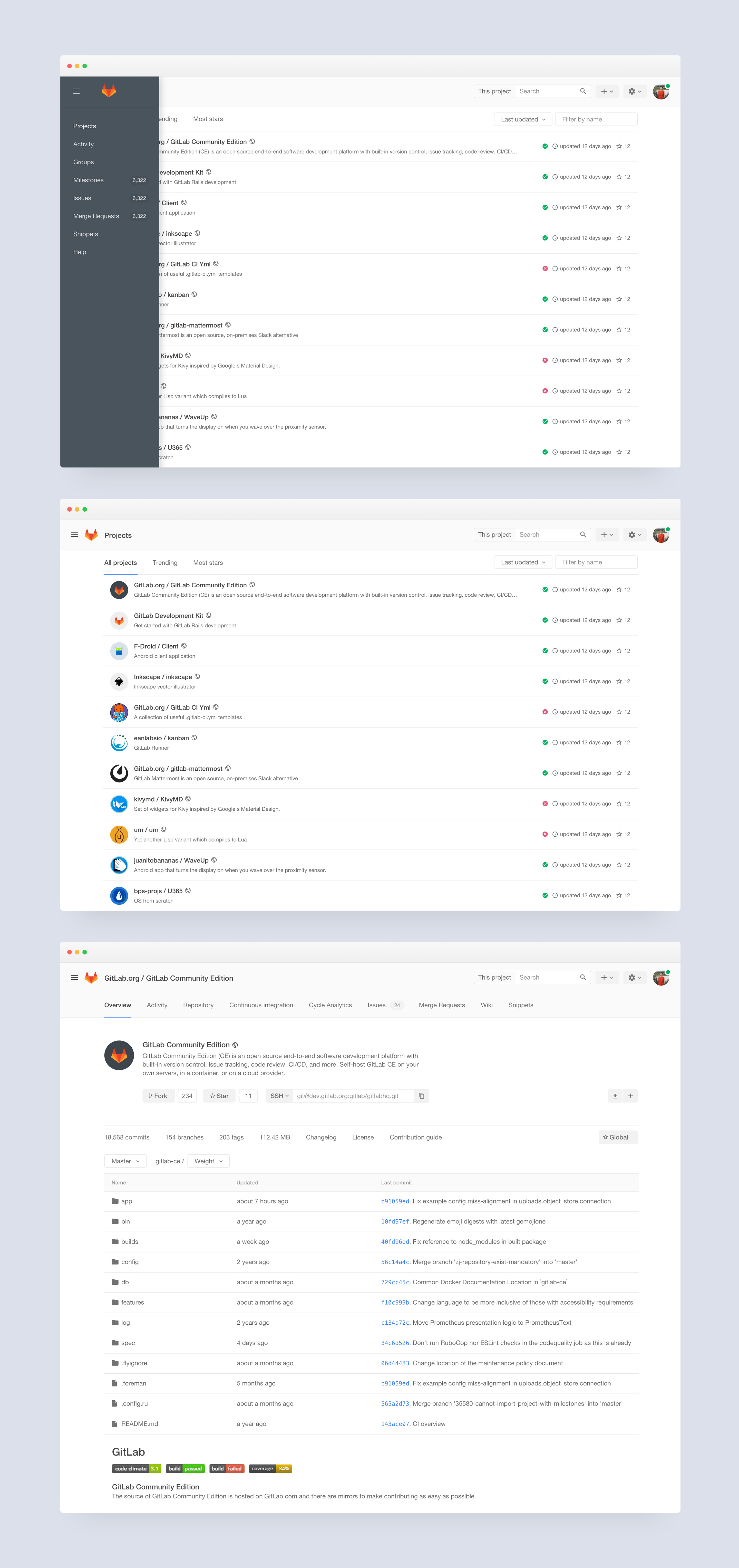
Second approach was to avoid deep navigation by giving distinct placements for a global navigation menu and a page-level navigation.
The main navigation was kept on the left side of every page to reflect the product highest-order structure. It gave shape to a platform. In many ways, the main navigation defined the boundaries of the platform itself.
Breadcrumbs were used as a navigation aid to help orient users within complex hierarchy of organizations with multiple projects and groups (EE).
Local navigation (page-level navigation) varied often, so it was decided to treat it differently in order to coordinate menus with user tasks.
GitLab CI
GitLab CI is a web application with an API that stores its state in a database. It manages projects/builds and provides a valuable overview for developers.
Continues integration in GitLab was an amazing way of process automation, but main pain point for Gitlab community was its setup.
From the customer interviews I learned that the help section was never used during the setup, everyone just googled, running into frustrating experience. Java developers did not always understand how to test java since Gitlab CI was created on Ruby. When configuring the CI, developers were prompted to describe the tests in a separate yml file and not everyone knew how to do it.
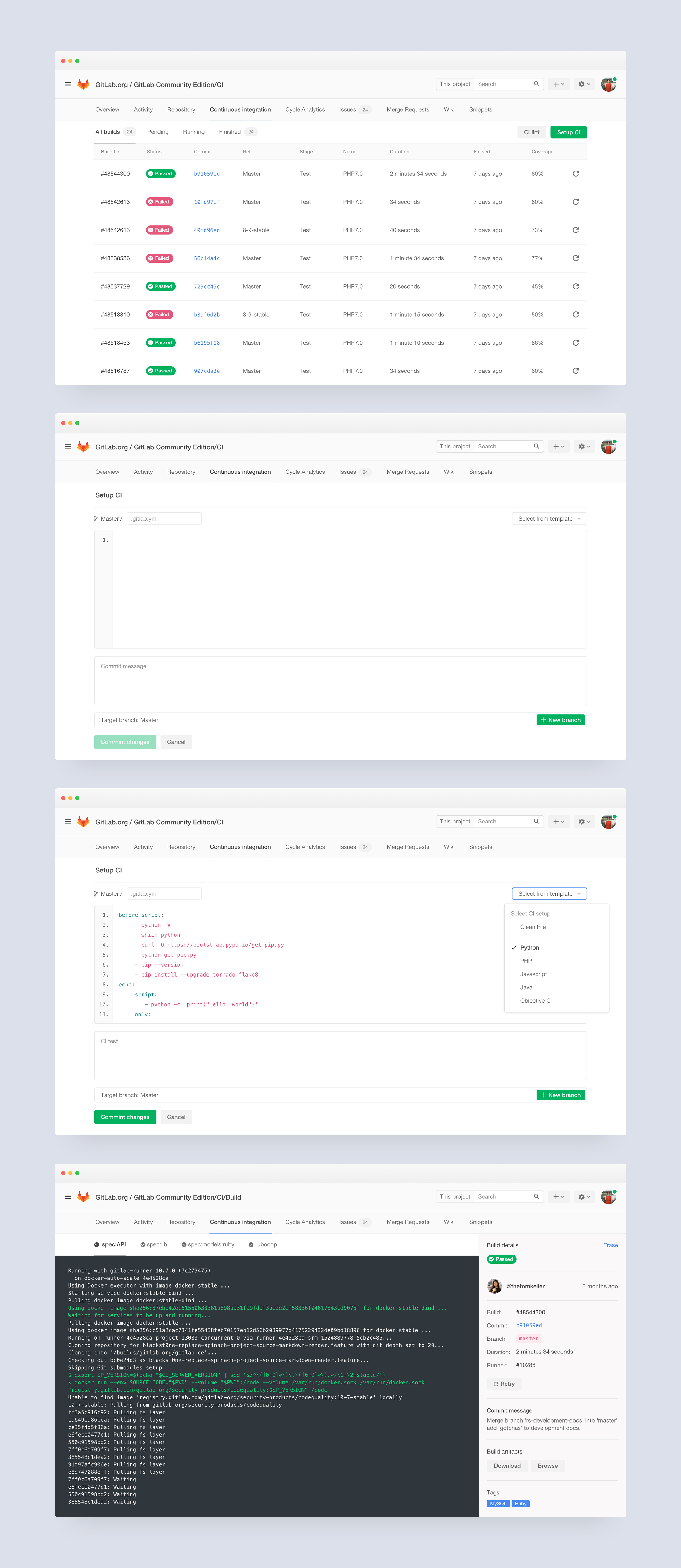
Suggested solution was to create a set of templates for popular programming languages in order to provide a frustration-free and informative environment for GitLab CI setup.
Visual consistency
Together with CTO, I've designed the set of UI elements that help the community to build their own features for the product.
Crafted by Andriy Dyadyura
Crafted by Andriy Dyadyura
Crafted by Andriy Dyadyura
Crafted by Andriy Dyadyura
Crafted by Andriy Dyadyura